

Responsive Layouts
Web & Mobile Layouts That Work Perfectly on Every Screen
A responsive layout ensures your website or app looks great and functions smoothly across all devices — from desktops to tablets and smartphones. I design and build layouts that adapt automatically to different screen sizes, offering users a seamless experience without zooming, pinching, or scrolling issues.
Whether you’re running an online store, service website, or mobile-first application, I make sure your layout is clean, readable, and easy to navigate — no matter how your users access it.
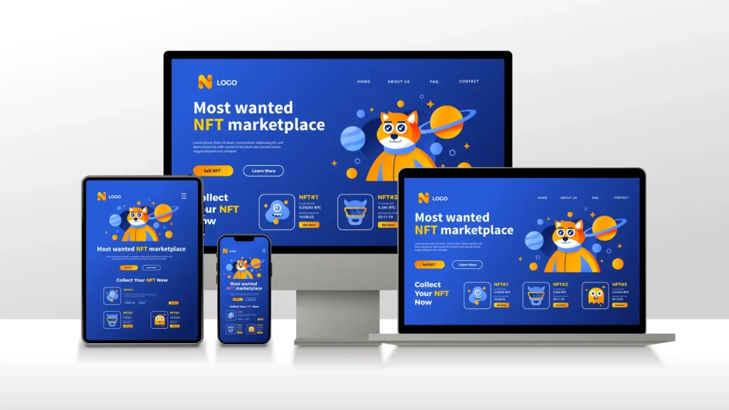
Responsive design isn’t just about shrinking content — it’s about rethinking how users interact with your platform on every screen. My approach is based on usability, flexibility, and performance.
-
I analyze your content, goals, and target devices
-
I plan layout breakpoints that adjust to desktop, tablet, and mobile
-
I design clean, mobile-first interfaces using grid systems and flexible spacing
-
I test layouts across major devices and screen sizes to ensure consistency
-
I optimize for speed, accessibility, and search engine performance
You don’t need multiple versions of your site — one responsive layout does it all.
Work Process
✅ Device & Platform Planning
I determine how your content should display on different screen sizes and prioritize what matters most on smaller devices.
✅ Mobile-First Layout Design
I create flexible grids and spacing that adjust naturally — ensuring users get the best version of your content on any device.
✅ Testing & Optimization
Layouts are tested across real devices and browsers for usability, readability, and visual accuracy.
Benefits of Responsive Layouts with me
Mobile-First, Always Ready
Designed to look perfect on phones, tablets, and desktops — no separate versions needed.
Improved User Experience
Easy navigation and structured content help users stay longer and take action.
Faster Loading, Better SEO
Responsive layouts are leaner and load faster — helping your site rank higher on Google.
One Layout, Full Control
No need to manage different mobile/desktop versions — one layout does it all.
Compatible With Any CMS or Codebase
Whether you use WordPress, Webflow, or custom code — my layouts are ready to plug in and go.

